
前言
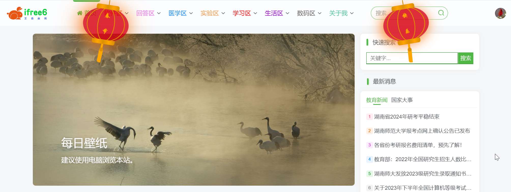
转眼就2024年(龙年)了,不知道这个寒假,大家收/发了多少红包呢?祝大家在新的一年里像龙一样勇往直前,无惧风浪,事业节节高,生活更美好!
在这个喜庆的日子里,当然也不要忘了装修一下我们的网站:顶部添加灯笼。
步骤
假设你的网站是基于WordPress,且用的是子比主题。(不是也没关系,编辑你的 index.php 或者 index.html 也一样)
1.进入网站后台,打开目录文件:wp-content/themes/zibll/index.php
2.定位到代码get_header(); ?> 下面(约第19行),在此处插入以下代码:
<div class="deng-box">
<div class="deng">
<div class="xian"></div>
<div class="deng-a">
<div class="deng-b"><div class="deng-t">春节</div></div>
</div>
<div class="shui shui-a"><div class="shui-c"></div><div class="shui-b"></div></div>
</div>
</div>

<div class="deng-box1">
<div class="deng">
<div class="xian"></div>
<div class="deng-a">
<div class="deng-b"><div class="deng-t">快乐</div></div>
</div>
<div class="shui shui-a"><div class="shui-c"></div><div class="shui-b"></div></div>
</div>
</div>

<style>
  .deng-box {
    position: fixed;
    top: -30px;
    left: 220px;
    z-index: 9999;
    pointer-events: none;
}

.deng-box1 {
    position: fixed;
    top: -30px;
    right: 222px;
    z-index: 9999;
    pointer-events: none;
}

.deng-box1 .deng {
    position: relative;
    width: 120px;
    height: 90px;
    margin: 50px;
    background: #d8000f;
    background: rgba(216, 0, 15, 0.8);
    border-radius: 50% 50%;
    -webkit-transform-origin: 50% -100px;
    -webkit-animation: swing 5s infinite ease-in-out;
    box-shadow: -5px 5px 30px 4px rgba(252, 144, 61, 1);
}

.deng {
    position: relative;
    width: 120px;
    height: 90px;
    margin: 50px;
    background: #d8000f;
    background: rgba(216, 0, 15, 0.8);
    border-radius: 50% 50%;
    -webkit-transform-origin: 50% -100px;
    -webkit-animation: swing 3s infinite ease-in-out;
    box-shadow: -5px 5px 50px 4px rgba(250, 108, 0, 1);
}

.deng-a {
    width: 100px;
    height: 90px;
    background: #d8000f;
    background: rgba(216, 0, 15, 0.1);
    margin: 12px 8px 8px 10px;
    border-radius: 50% 50%;
    border: 2px solid #dc8f03;
}

.deng-b {
    width: 45px;
    height: 90px;
    background: #d8000f;
    background: rgba(216, 0, 15, 0.1);
    margin: -2px 8px 8px 26px;
    border-radius: 50% 50%;
    border: 2px solid #dc8f03;
}

.xian {
    position: absolute;
    top: -20px;
    left: 60px;
    width: 2px;
    height: 20px;
    background: #dc8f03;
}

.shui-a {
    position: relative;
    width: 5px;
    height: 20px;
    margin: -5px 0 0 59px;
    -webkit-animation: swing 4s infinite ease-in-out;
    -webkit-transform-origin: 50% -45px;
    background: #ffa500;
    border-radius: 0 0 5px 5px;
}

.shui-b {
    position: absolute;
    top: 14px;
    left: -2px;
    width: 10px;
    height: 10px;
    background: #dc8f03;
    border-radius: 50%;
}

.shui-c {
    position: absolute;
    top: 18px;
    left: -2px;
    width: 10px;
    height: 35px;
    background: #ffa500;
    border-radius: 0 0 0 5px;
}

.deng:before {
    position: absolute;
    top: -7px;
    left: 29px;
    height: 12px;
    width: 60px;
    content: " ";
    display: block;
    z-index: 999;
    border-radius: 5px 5px 0 0;
    border: solid 1px #dc8f03;
    background: #ffa500;
    background: linear-gradient(to right, #dc8f03, #ffa500, #dc8f03, #ffa500, #dc8f03);
}

.deng:after {
    position: absolute;
    bottom: -7px;
    left: 10px;
    height: 12px;
    width: 60px;
    content: " ";
    display: block;
    margin-left: 20px;
    border-radius: 0 0 5px 5px;
    border: solid 1px #dc8f03;
    background: #ffa500;
    background: linear-gradient(to right, #dc8f03, #ffa500, #dc8f03, #ffa500, #dc8f03);
}

.deng-t {
    font-family: 华文行楷,Arial,Lucida Grande,Tahoma,sans-serif;
    font-size: 1.5rem;
    color: #ffa500;
    font-weight: bold;
    line-height: 42px;
    text-align: center;
    width: 25px;
    margin: 0 auto;

}

.night .deng-t,
.night .deng-box,
.night .deng-box1 {
    background: transparent !important;
}

@-moz-keyframes swing {
    0% {
        -moz-transform: rotate(-10deg)
    }

    50% {
        -moz-transform: rotate(10deg)
    }

    100% {
        -moz-transform: rotate(-10deg)
    }
}

@-webkit-keyframes swing {
    0% {
        -webkit-transform: rotate(-10deg)
    }

    50% {
        -webkit-transform: rotate(10deg)
    }

    100% {
        -webkit-transform: rotate(-10deg)
    }
}
</style>3.保存并刷新你的首页。
常见问题:
1.不会下载文件?答:请查看下载帮助。
2.我应该下载哪个文件/软件? 答:通常“数字后缀”表示版本号(越大越新),下载数字最大的即可!
3.下载地址为什么隐藏了? 答:防止爬虫索引,敏感内容登录即可免费下载!
2.我应该下载哪个文件/软件? 答:通常“数字后缀”表示版本号(越大越新),下载数字最大的即可!
3.下载地址为什么隐藏了? 答:防止爬虫索引,敏感内容登录即可免费下载!
THE END


暂无评论内容